ngTemplateOutlet: The secret to customisation
- Software engineering
ngTemplateOutlet is a powerful tool for creating customisable components. It is used by many Angular libraries, as well as us at G-Research, to enable users to provide custom templates into our components.
In this article we demonstrate how to use ngTemplateOutlet, along with ngTemplateOutletContext, to make a component completely customisable.
Customising a Dropdown Selector
We will be working with a dropdown selector as it serves as a great use case for customising a component with ngTemplateOutlet . Our dropdown selector is used by multiple clients (for the sake of this demo, my two shark-obsessed children) who each have a number of outstanding feature requests. Let’s start by introducing our component code and then start adding new features.
(If you want to skip to the end, the final customisable selector is live here).
Selector Component
Our selector begins with a clean api. It takes a list of strings and displays those via ngFor in a dropdown.
export class SelectorComponent {
  selected: string;

  @Input()
  options: string[];
  @Output()
  selectionChanged = new EventEmitter<string>();

  selectOption(option: string) {
    this.selected = option;
    this.selectionChanged.emit(option);
  }
}

// selector.component.ts
All looks good so far with a clean component interface.
<div dropdown>
  <button dropdownToggle>{{selected || 'Select'}}</button>
  <ul dropdownMenu>
    <li *ngFor="let option of options" (click)="selectOption(option)">
      {{option}}
    </li>
  </ul>
</div>

<!-- selector.component.html -->
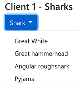
Using this component our first client can select their favourite shark.
<app-selector [options]="sharks"></app-selector>

<!-- client-one.component.html -->
Feature: Customise Option Text
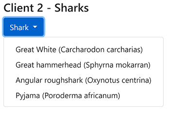
Our second client, who also likes sharks, wants to include the Latin name in their dropdown menu. We could make a small change by adding a display call-back function as an Input to update the displayed text. This is not necessarily recommended.
@Input()
displayFunc: (string) => string = x => x;

// selector.component.ts
<li *ngFor="let option of options">
  <!-- Pass the option through the display callback -->
  {{displayFunc(option)}}
</li>

<!-- selector.component.html -->
<app-selector [options]="sharks" [displayFunc]="appendLatin"> </app-selector>
<!-- client-two.component.html -->
Reminder: This is not the recommended approach
Feature: Safe To Swim Icon
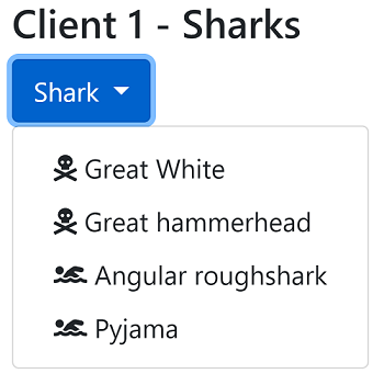
Client one now wants to include an icon depicting whether a shark is safe to swim with. They provide us with their hefty icon package which we have to use. How are we going to support this?
Unlike the previous request, which just changed the text content, adding in an icon will require structural changes to our HTML template.
Wrong approach using *ngIf
Without knowing about ngTemplateOutlet we could decide to use *ngIf and another callback that provides the icon name based on the current shark.
<li *ngFor="let option of options">
  <!-- Introducing the icon into our selector -->
  <c1-icon *ngIf="getIconFunc(option)" [name]="getIconFunc(option)" />

  {{displayFunc(option)}}
</li>

<!-- selector.component.html -->
If no icon callback is provided the default returns undefined to hide the icon via our ngIf. This ensures that our other clients do not see these icons.
@Input()
getIconFunc: (string) => string = x => undefined;

// selector.component.ts
<app-selector [options]="sharks" [getIconFunc]="getIconFunc"> </app-selector>

<!-- client-one.component.html -->
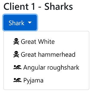
This works and enables them to have the following selector but let’s not get too excited because this was not a great solution.
Unhappy Client 2 due to Icon dependency
In the previous feature request we introduced a dependency on client one’s icon package. This is really bad! Consider forcing other clients to install an extra dependency to compile their applications even though they will never actually require the package.
You may consider your best option is to fork the component and have a separate instance for each client. While this may be a quick fix for client two, it now means you have multiple dropdown selectors to support. Not a happy position as a developer!
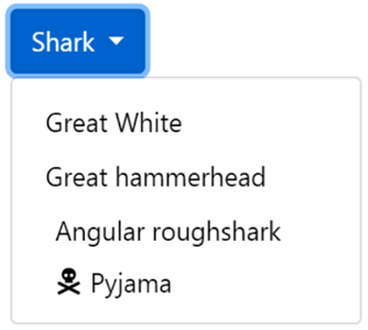
What about using ng-content?
In Angular we can use <ng-content> to perform content projection. Perhaps we could replace the icon in the template with a <ng-content> and have client one project their icon into our selector. This way we can remove the icon dependency from our component.
<li *ngFor="let option of options">
  <!-- Removed: <c1-icon [name]="swimIcon(option)" /> -->
  <ng-content></ng-content>
  {{displayFunc(option)}}
</li>

<!-- selector.component.html -->
<app-selector [options]="sharks">
  <c1-icon [name]="swimIcon(????)" />
</app-selector>

<!-- client-one.component.html -->
While this looks promising it will not work. The icon will only be displayed for the last item in the list. You can only project content into a single location unless you use named slots. There is no easy way to dynamically name slots like in our list above.
The main issue is that <ng-content> is not aware of the context where it is being rendered. It does not know the shark option it is being used for. This means that we cannot customise its content based on the dropdown value.
If only there was a way for us to project a template into our component that was also aware of its local context. This is where ngTemplateOutlet comes in!
NgTemplateOutlets
ngTemplateOutlet acts as a placeholder to render a template after providing that template with context. In our case we want a template placeholder for each dropdown option and the context would be the shark.
The Angular documentation for NgTemplateOutlet is currently a little lacking. This issue has been raised and ideas on how to demonstrate the feature have started being shared.
Defining a Template
Before we can use ngTemplateOutlet we must first define a template using <ng-template>. The template is the body of the <ng-template> element.
<ng-template #myTemplate>
  <div>Hello template</div>
</ng-template>
To reference the template we name it via # syntax. By adding #myTemplate to the element we can get a reference to the template using the name myTemplate . The type of myTemplate is TemplateRef.
Rendering a Template
The content of a <ng-Template> element is not rendered in the browser. To have the template body rendered we must now pass the template reference to a ngTemplateOutlet.
<!-- Define our template -->
<ng-template #myTempalte> World! </ng-template>

Hello
<!-- Render the template in this outlet -->
<ng-container [ngTemplateOutlet]="myTempalte"></ng-container>
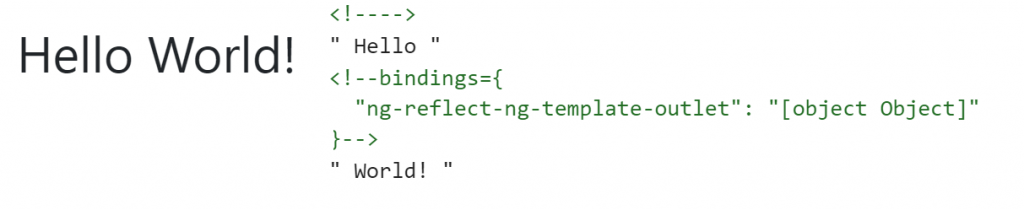
ng-template and ngTemplateOutlet enable us to define re-usable templates which in itself is a powerful feature but we are just getting started!
Supplying the Template Context
We can take templates to the next level by supplying a context. This enables us to pass data to the template. In our case the data is the shark for the current option. To pass context to a template you use [ngTemplateOutletContext].
Here we are passing each dropdown option to the optionTemplate.This will enable the option template to display a different value for each item in the list. We are also setting the current index to the idx property of our context as this can be useful for styling.
<li *ngFor="let item of items; index as i">
  <!-- Setting the option as the $implicit property of our context along with the row index -->
  <ng-container
    [ngTemplateOutlet]="optionTemplate"
    [ngTemplateOutletContext]="{ $implicit: option, idx: i }"
  ></ng-container>
</li>

<!-- selector.component.html -->
You can also use the abbreviated syntax below.
<!-- Alternative syntax -->
<ng-container
  *ngTemplateOutlet="optionTemplate; context:{ $implicit: option, idx: i }"
></ng-container>
Using the Context in your template
To access the context in our template we use let-* syntax to define template input variables. To bind the $implicit property to a template variable called option we add let-option to our template. We can use any name for our template variable so let-item or let-shark would also bind to the $implicit property in the context.
This enables us to define a template outside of the selector component but with access to current option just as if our template was defined in the dropdown itself!
<ng-template #optionTemplate let-option let-position="idx">
  {{ position }} : {{option}}
</ng-template>
To access the other properties on our context we have to be more explicit. To bind the idx value to a template variable called position we add let-position=idx. Alternatively we could name it id by adding let-id=idx.
Note that we must know the exact property name when extracting values from the context that are not the $implicit property. The $implicit property is a handy tool which means users do not have to be aware of this name as well as having to write less code.
Library authors please add the type structure of your context to your documentation! There is currently no auto-complete / type checking available for template input variables.
By using template input variables we are able to combine state from where we define the template, with the context provided to us where the template is instantiated. This provides us with some amazing capabilities!
Solving our feature requests
We are now in a position to solve our clashing client demands with a single selector. As a reminder, our first client wanted their custom icon in the dropdown while our second client, justifiably, did not want that dependency.
Setup the template outlet in our component
To use a template within our app-selector we replace the display function and icon element with a ng-container with a ngTemplateOutlet on it. This outlet will either use the user’s optionTemplate or our defaultTemplate if no template is provided by the user.
<li *ngFor="let option of options; index as i">
  <!-- Define a default template -->
  <ng-template #defaultTemplate let-option>{{ option }}</ng-template>

  <ng-container
    [ngTemplateOutlet]="optionTemplate || defaultTemplate"
    [ngTemplateOutletContext]="{ $implicit: option, index: i}"
  >
  </ng-container>
</li>

<!-- selector.component.html -->
Default templates are a great way to retro-fit
ngTemplateOutletto an existing component.
To ensure that the template will be able to display the current option we must remember to setup the context. We set the option to be the $implicit property and also provide the current row index.
The component will accept the optionTemplate via an Input.
@Input()
optionTemplate: TemplateRef<any>;

// selector.component.ts
You can also use
@ContentChildto pass the template into your component. This forces the template to be defined within the<app-selector>which may be preferred if you have a lot of Input properties. However, this does make it harder to share templates across multiple component instances.
Define the client template
Now we can define our custom template in client one’s codebase. Here we use the template input variable to ensure we display the correct icon for the given shark.
<ng-template #sharkTemplate let-shark>
  <c1-icon name="{{ getIconFunc(shark) }}" />
  {{ shark }}
</ng-template>

<!-- Pass sharkTemplate to our selector via an Input -->
<app-selector
  [options]="sharks"
  [optionTemplate]="sharkTemplate"
></app-selector>

<!-- client-one.component.html -->
We then pass our template by reference into the component via the optionTemplate @Input.
This all results in our final shark selector meeting client one’s requests and at the same time ensuring no other clients require the icon dependency any more.
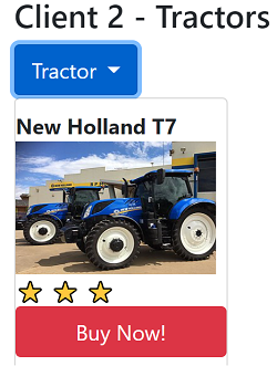
Tractors instead of sharks
Just when we thought we were finished client two comes back to us with the exciting news that they don’t like sharks anymore and instead they love tractors! They now want a dropdown to pick tractors with pictures and buttons.
The great thing is that we can give them whatever they want without changing any of our selector code. This is the beauty and power of ngTemplateOutlet.
We just update the template use in client two’s code base for tractors and pass that in.
<!-- Defined in Client Two's codebase -->
<ng-template #tractorTemplate let-tractor>
  <label>{{ tractor.name }}</label>
  <img src="{{ tractor.img }}" />
  <button>Buy Now!</button>
</ng-template>

<!-- No change to selector for brand new dropdown style -->
<app-selector
  [options]="tractors"
  [optionTemplate]="tractorTemplate"
></app-selector>

<!-- client-two.component.html -->
Final Selector Code
By using ngTemplateOutlet we are able to seperate the work of being a selector from the user customisations. This enables us to maintain a minimal component api without restricting our clients’ creativity.
export class SelectorComponent<T> {
  @Input()
  options: T[];
  @ContentChild("optionTemplate")
  optionTemplateRef?: TemplateRef<any>;

  @Output()
  selectionChanged = new EventEmitter<T>();
}

// selector.component.ts
<li *ngFor="let option of options; index as i">
  <ng-template #defaultTemplate let-option>{{ option }}</ng-template>

  <ng-container
    [ngTemplateOutlet]="optionTemplate || defaultTemplate"
    [ngTemplateOutletContext]="{ $implicit: option, index: i}"
  >
  </ng-container>
</li>

<!-- selector.component.html -->
Conclusion
I hope that after reading this article you will be able to use ngTemplateOutlet to support template customisations in your own components! I also hope you will have a deeper understanding of how your favourite component libraries are using ngTemplateOutlet to enable you to customise them.
Further Reading
Here I have covered a single use case for ngTemplateOutlet. If you liked this article then I would strongly recommend reading Alex Inkin’s article Agnostic components in Angular which takes things even further.
Live Example
Experiment for yourself with this live example on Stackblitz or can clone the repo StephenCooper/ngTemplateOutlets from GitHub.
If you prefer watching videos you can see me present this article at Angular Connect 2019.
Written by Stephen Cooper, a Developer at G-Research